Monday, May 30, 2011

Announcement

I've begun a new blog. It's a new era for us, and time for a change.

Saturday, we had our offer accepted on the land we picked out. We will close on July 13. From there, we will begin building our new home. :)

Follow along with us on our journey at this new site: Hand To The Plough

Thursday, May 26, 2011

Answering Those Questions:

So, a lot of you have been asking the question, "Why build, instead of buy?" Here's my answer.

In Virginia, an older home with some need for TLC would be an awesome investment. You'd have those great wood floors, gorgeous molding, staircases with drama, beautiful "bones", etc., and you could come out on top by fixing up bathrooms and kitchen. My friend, Hosanna, has a home like that. However, in Washington state (at least, in this city).....we don't have "lovely old homes in need of TLC." We have homes built in the 70's or 80's in need of TLC. They're almost all "doublewide" type homes, too...Washington is famous for its low-roofed, ranch-style, porchless types. They remind me of glorified campers.

I suspect the reason for that has to do with Washington *ahem* not having been settled until more recently....it doesn't have the "colonial era" homes that Virginia does. Plus, it was settled by hippies...who live in campers. LOL!

There are very few things in our area (Lacey, WA) on the market right now for around $200,000 (our spending limit) that offer 3 bedrooms, an area (den) to teach piano in, and a lot of promise for beautiful upgrades (and hopefully, a yard). Here are some links showing you what's for sale in our desired location that is within our price range:

Link 1  Leaves a little room price-wise for some upgrades, but will still always look like a doublewide on the outside
Link 2 Has a fairly nice upgraded kitchen (not my style), but a very tiny back yard, and some weird, outdated features, such as the wall of wood paneling in the living room. Also, the exterior is less than beautiful, too.
Link 3 Another house, near the square footage of the one we're going to build, and closer to 200K. Leaves money for only a couple upgrades, and still leaves us with a tiny backyard, and.....a red doublewide.

None of these would give us much equity if we put some upgrades into them. Even with new windows and flooring and cabinets, scrubbed & polished & painted---you still have a low profile, ranch-style, not-very-pretty home. Sadly. All of them. We have been watching this trend continue for months, now. Then.......we found Adair Homes.

Adair Homes offers a few selections within our price range. They're not a custom-home company. They are a "Costco" of home building supply. With their home-building scheme, we are encouraged to do a lot of the work in the building and lot preparation ourselves. This saves us money, project by project, and gives us a brand new home at the end, complete with a lot the size we picked. We are NOT encouraged to draw up our own home plan and change things as we go. We had around 4 plans to pick from, and we went with the 1643 (square ft.) plan.

We expect to invest around $220,000 in the actual supplies, land, and labor, and end up with a 1643 sf home on 1/3 acre lot appraised at around $300,000. This is based on the data we read about others who had completed projects with Adair. When we finish our home, we'll have spent the same amount we would have ended up spending with a "fixer-upper" only we have not just an "ok" kitchen, or "refinished wood flooring" but a hand-picked kitchen, a modern open floor-plan, a studio for 2 pianos, and brand new Shaw wood floors.

Granted, we will be working our butts off, just as one might if one purchased an older home and put upgrades in it. BUT we will have a VERY NEW AND MODERN home to sell (should we choose to) in 5-10 years. It will be nice to move into a brand newly-built home after having put the "sweat equity" into building it rather than moving into a place that require months of work, bit by bit, putting up with the mess as we go.

Know this, however, East Coasters: were we to be able to find a deal like THIS ONE or THIS ONE or THIS ONE (OMG, OMG!!)  or THIS ONE ............well, let me just say.....we'd have bought it already, and be working on it RIGHT NOW. I mean.....we bought a subscription to "This Old House"!! It's like...in my blood. I grew up in an old home. I am not kidding when I say, "The 1634 by Adair is NOT my dream home." But, it's a good investment for this area. If we needed to move for some reason....we have a lot of good stuff to show for our work. We expect, in 7 years, to have a pretty bangin' newer, beautiful, modern home to sell.


ANYHOW. Without further ado, here is the final choice (I know it's different from Facebook's post, but...we're still vacillating.) ..... 


The only change we will be making is to build a wall on the left just as you walk in the front door to enclose that "sitting room" into a studio for my 2 (hopefully 2, by then) pianos. The lot we picked is on a busier street...hopefully a good location to put a sign up for my business.

Final Announcement:

We put an offer on the land today. :D :D :D :D

Tuesday, May 24, 2011

More Money-Saving

Would you believe me if I told you that TODAY.......we just bought THIS?


Yep. It's a Toyota Prius. In the interest of saving even more money for our new home, we traded in the mammoth gas-hog, known as X-Terra:


I can't say I was too sad to see it go.....Violet & I both decided we like the "green car" better. :) It should cost us (we predict) 1/3 the money in gas per month. It feels, actually, pretty roomy inside. I was surprised when we hooked up the car seats and took it for a spin. It's used, so the leather seats it boasted were a bit more affordable. Wow, leather seats make it really easy to twist around and tend to children in the back seat! They also make it pretty comfy for long rides: it's easier to slip and slide your bottom around and get more COMFY! The hatch back makes for a great diaper-changing station.....and the elbow room in the back seat made us suspect we could even fit a 3rd child in there.....should that event come to pass in the d i s t a  n  t   future. 

We really hope the gas savings will give us more and more spare change to put into our closing costs, and any upgrades or unforeseen "projects" we might have to do during this home-building process.

Tomorrow Ben & our Adair representative meet the excavator at the lot we picked out. Soon, we will be making an offer, signing papers, and starting to DIG!

Wednesday, May 11, 2011

Bedroom Favorites: Hello, Gray!

Last year we spent 11 months in Virginia, living in a townhouse rental. When I arrived, the walls were all kinds of weird colors. One bedroom was orange, one was gray, and the furniture in the gray room was painted a Chinese Red Lacquer, complete with silver spray-painted metal hardware. Not only that, but at the top of the wall was a "Carolina Blue" stripe, about 8 inches long. It was pretty nauseating. I say that...because being newly pregnant, lots of things nauseated me. :)

Here's what it was looking like:


WIth this color blue stripe:

I agonized over that stripe....and dreaded going to bed at night because of it.  The landlords told me I couldn't paint, so I slapped this up there as a last resort. (textured, paintable wallpaper in cream color.)

...........and LO....it looked awesome. Not only that, but I paired it with my grandmother's maple furniture.....and a creamy sheepskin rug....

I discovered GRAY.

Now I am obsessed with it. Especially in a bedroom. It is so restful.....so aged.....so timeless.....the essence of softness. It makes me sleepy just looking at it.


By the way....is it GREY or GRAY? I adore how natural textures (stone, wood, furs, straw/grasses, shell, and even water) all flow smoothly through the greys. It's a short step to get botanicals of all shapes, textures, and colors to also compliment grays in a room. Something very dear to my heart....botanical...

Anyhow. Hope you enjoyed strolling through my design dreams. Only a couple short weeks, now, till we know if we are going to be building a home or not!

Monday, May 2, 2011

Favorite Things

I'm trying to conjure up "my favorite kitchen" these days. It takes me a while to figure out what I like. I have to delve through photos and blogs and examples on the internet for days before a pattern starts to emerge. 

"What do I like in a kitchen?" 

It's been bugging me since we started discussing the possibility of building a home. Well, something finally popped out at me today while I was google-imaging. (is that a word?) 

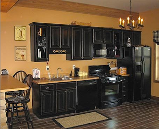
Black cabinets.

At first I was bothered by it. Why does that look so attractive? What about that is making me so excited? Scroll through and look at some, if you would.


Oh yeah, I am LOVING a faucet over the stove...how brilliant is that??!!!


In particular this one caught my eye (below), and I saw the "french hens" and something began to make sense. The black & white speckled french hen, coupled usually with creams, yellows, and red....brightly colored ceramic dishes, and racks and racks of wine. Also usually some wire mesh coverings on the cabinet doors, and some criss-cross wood panes on the glass cabinets. I'm thinking this is treading close to French country.


Here are a few more that stood out to me:


Especially this one, below. Something about the exquisite combination of old and new, clean and simple with delicacies, the oh-so-necessary botanical element, and the craving for stone (on top of the armoire), and iron. All completely satisfied. This.............this room is definitely All Me.


This kitchen with its black and white tile reminds me of something else I know I love: Maxfield Parrish.


Here are some Parrish paintings. You can see the use of the black and white checker pattern in his art.


 He did do some paintings that were more than kitchens. :)

And not all caricatures.


Anyway.....back to kitchens. :)This one (below) is a bit busy for me. It has nice aging, but too much stuff. I love the contrast of the natural brown wood grain against the black rubbed-off cabinets.


Another thing I discovered I love: bell lanterns. :)        (below)


 A bit too much white here (below), but I love the black against the white....and the copper pots. :)


Another one of my top favorites: Once again the beautiful grain of the wood is really brought out by the black. I think that grain in wood contains subtle, darker striating, which is accented when used near black. The wood alone would have melted mildly into the creamy white walls. But with black, I can see much more texture in the wood. Adding it to the ceiling, as well, is even BETTER.


I noticed, too, that the textures in the woven basket-like stool covers (above) and the baskets in the cabinets (below) were brought out by the black. LOVE.


Wednesday, April 20, 2011

Violetisms for Today


It started out as an inspiring conversation about forgiveness. 

She said, "Mommy, I'm sorry. I really didn't mean to do that." 

I said, "I forgive you." 

She said, "You always forgive me. You always hassto forgive me. We always hassto forgive people." 

I said, "Yes, do you know why?" 

"No." 

"Because God forgave us. We forgive people because God forgave us." 

That's when it went off track. "I know dat.      I don’t know everysing........I know addigators. I never seen addigators....I don’t know their names.            Maybe one is named Francis."

Then it made another hairpin turn.

She looked at her feet.
"I always have sandals on. Like Jesus."